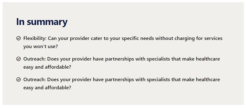
Sitecore Headless: a listing component using placeholders
We need two JSON Rendering components: one for the list items and one for the container that holds the list. For example: MessageListItem, MessageListCard.
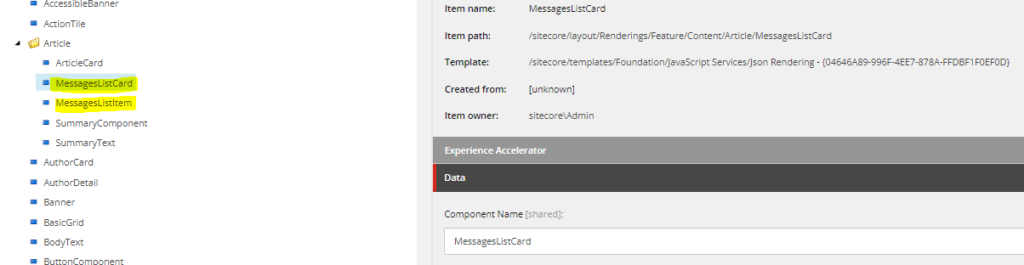
The Next.js code for the list item looks like this (we have a custom theme):
import { styled } from '@mui/material/styles';
import {
  RichText,
  RichTextField,
  ImageField,
  Image,
  withDatasourceCheck,
} from '@sitecore-jss/sitecore-jss-nextjs';
import { xxxTheme } from '@xxxx/yyy.theme';
import { xxxText } from '@xxx/yyy.components';
import { ComponentProps } from 'lib/component-props';

interface Fields {
  LeadingIconField: ImageField;
  MessagesListItemTextField: RichTextField;
  TrailingIconField: ImageField;
}

type MessagesListItemParams = ComponentProps & {
  fields: Fields;
  params: { [key: string]: string };
};

const StyledMessagesListItem = styled('li', { name: 'MessagesListItem' })(
  ({
    theme: {
      xxx: { spacing },
    },
  }: {
    theme: xxxTheme;
  }) => ({
    display: 'flex',
    gap: spacing(100),
    marginBottom: spacing(200),
    '&:last-of-type': {
      marginBottom: 0
    }
  })
);

const MessagesListItem = ({ fields }: MessagesListItemParams): JSX.Element => {
  return (
    <StyledMessagesListItem>
      <Image field={fields.LeadingIconField} />
      <xxxText size="bodyLg" component="div" disableSpacing>
        <RichText field={fields.MessagesListItemTextField} />
      </xxxText>
    </StyledMessagesListItem>
  );
};

export default withDatasourceCheck()<MessagesListItemParams>(MessagesListItem);
The Next.js code for MessageListCard looks like this:
import { styled } from '@mui/material/styles';
import {
  ComponentParams,
  ComponentRendering,
  LinkField,
  Placeholder,
} from '@sitecore-jss/sitecore-jss-nextjs';
import { xxxTheme } from '@xxxx/yyy.theme';

interface Fields {
  LinkField: LinkField;
}

export interface MessagesListCardProps {
  rendering: ComponentRendering;
  params: ComponentParams;
  fields: Fields;
}

const StyledMessagesListCard = styled('ul', { name: 'MessagesListCard' })(
  ({
    theme: {
      xxx: { palette, spacing },
    },
  }: {
    theme: xxxTheme;
  }) => ({
    backgroundColor: palette.neutral.background.medium,
    padding: spacing(600),
    width: '100%',
  })
);

export const MessagesListCard = (props: MessagesListCardProps): JSX.Element => {
  return (
    <StyledMessagesListCard>
      <Placeholder name='message-list-title' rendering={props.rendering} />
      <Placeholder name='message-list-item' rendering={props.rendering} />
    </StyledMessagesListCard>
  );
};

export default MessagesListCard;
For the list item, we need a datasource template:
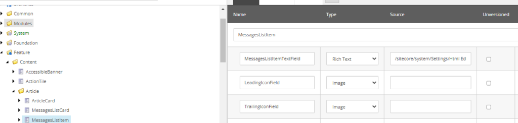
We also need a parent (container) datasource template to hold the list:

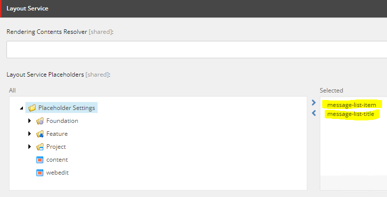
We need to create a couple of placeholders,
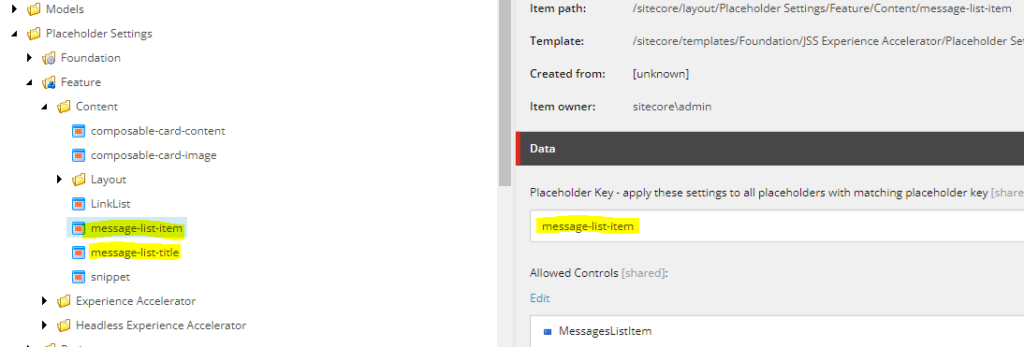
and allow them inside the “MessageListCard” component:
Finally, when we drop the component on a page and set the datasource, it looks like this: